The Planning Grid: Creating a Framework for Design
A Planning Grid is an overlay of lines usually represented by a ‘long dash-dot-long dash-dot’ (they need not necessarily be horizontal and vertical, but often are) and is a design tool used by us architects to create some kind of order on what is otherwise a (chaotic) blank white paper when they start to design a building.
It kind of gives us a handle on which we can hang our hats before rolling up our sleeves, loosening our ties and getting down to some serious work.
Healthcare designers can derive their planning grids in one of the two following ways:
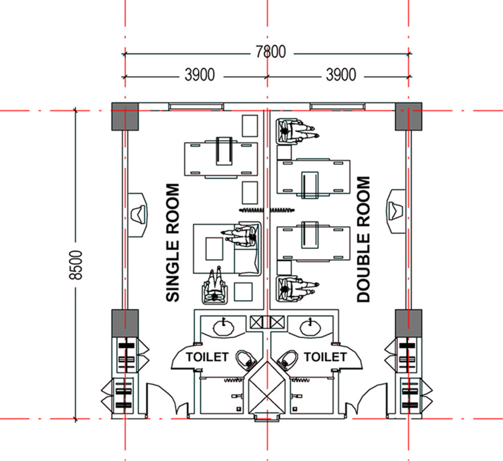
- In urban situations, where the hospital takes the form of a vertical building comprising of a podium containing diagnostic / therapeutic and interventional services and a tower housing the inpatient facilities, the planning grid is largely determined by the layout of the inpatient tower. The module(s) used to determine the shape and size of this grid is the module(s) used to house the various kinds of inpatient facilities (rooms + toilets) conceptualized by the designer. In the example given below you can see how the planning grid modules (in red) of 3.90 M x 8.50 M is determined by the accommodation desired for a single bed patient room, a double bed patient room and their toilets.
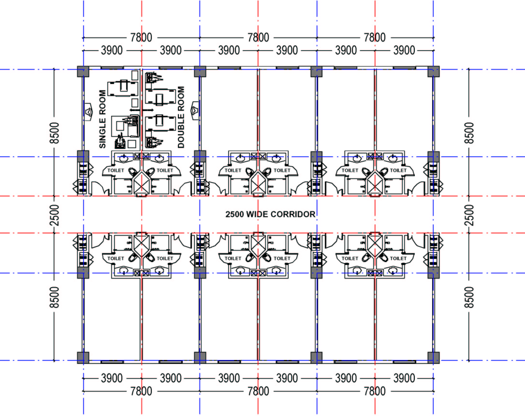
Expanding on this with the addition of the access corridor and stringing the rooms out in a line, as in the plan below, we see how the planning grid starts taking form. Looking more closely at this plan we can see something important has been determined, namely, the positions of the columns that will support the building. We can thus see how the structural grid (in blue), the network of lines defining the location of columns, has been derived from the planning grid. The structural grid need not necessarily be the same as the planning grid, but is usually derived from it.
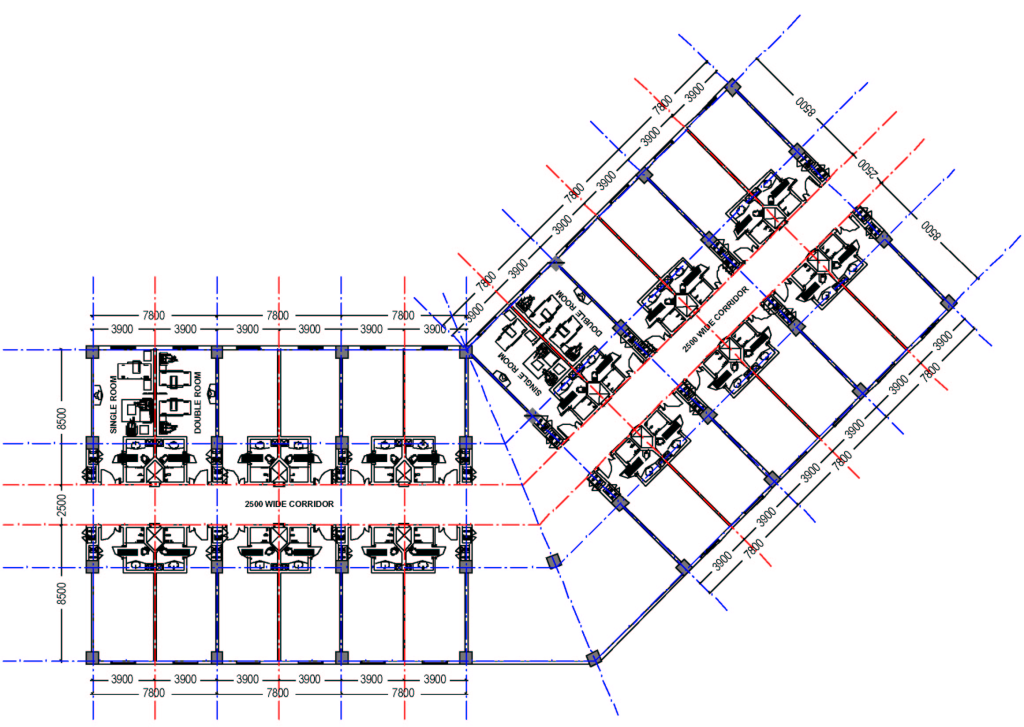
Coming to the next example, we can see that the designer has decided to twist the entire inpatient tower block at an angle to the horizontal / vertical one. This is just one example of how the planning grid could take almost any conceivable shape depending on what the designer wants to do with it. Having said that, we can still see how this twisted planning grid still serves it’s purpose of imposing order on a blank chaos, giving the designer a framework within which to design, even the rest of the hospital.
Maybe you don’t see that. Well, consider this. The positions of the structural columns determined by this planning grid, twisted or otherwise, will continue downwards through the rest of the hospital, through the lower floors (the podium mentioned above) till their respective foundations, where they will transfer their load to the ground below. Hence the lower floors (the podium), which will contain the Operation Theater Suite, the Radiology and Imaging Sciences Department, the Main Kitchen and the Mechanical Areas in the basement, to name just a few, will all need to be designed within the constraints of these column positions. Extrapolating from here, we can see how the façade of the hospital will need to be designed in harmony with the windows of the inpatient rooms above, which will be designed with the use of the planning grid. Even if the podium extends beyond the footprint of the tower above, it is almost certain that the positions of the additional columns required would be derived from the structural grid used for the tower, which has been derived from the planning grid determined by inpatient facility design.
In vertically organized healthcare facilities, we design from the top (inpatient tower) down (the diagnostic/therapeutic/interventional podium).
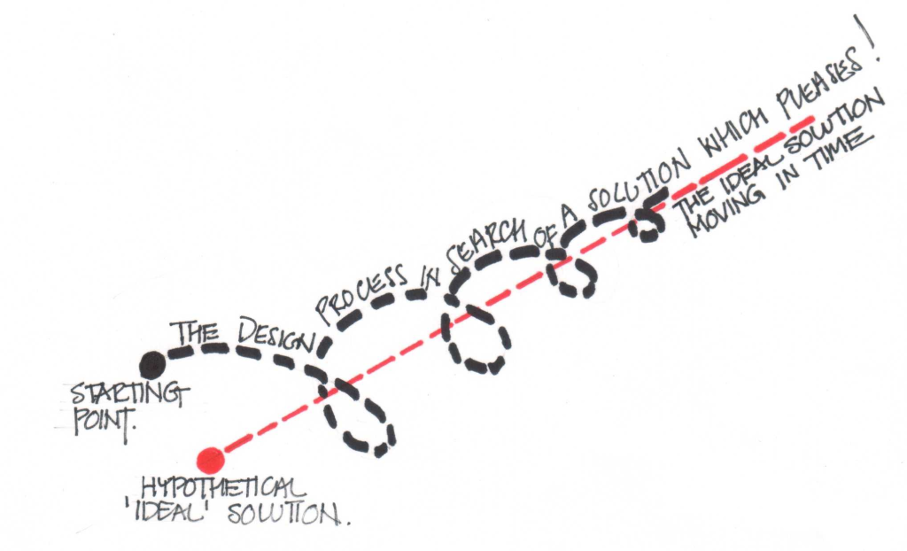
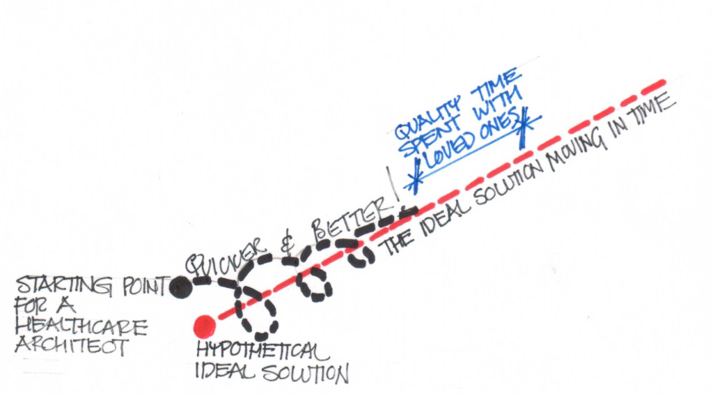
Not really. Actually we design in a kind of collapsing spiral with a time dimension. What I mean by this is illustrated in the sketch below.
The design process can be conceptualized as a process that begins at a point in time and space and endeavors to find for its particular problem definition and in its particular circumstances (real world time and money constraints) an (of course, illusory) ideal solution. In the sketch above, let us imagine that the red dot is this “ideal” solution and the black dot is the point in time and space that we begin our search for this solution. The blue dashed line represents our design path in the third ‘time’ dimension, and the red dashed line represents the movement of the ideal solution in this time dimension. We can see how the designer so to speak ‘circles’ the ideal solution, thinking about it in its entirety, always coming closer, but fated, however, never to reach that elusive ideal.
I hear the cry from my audience, “There are many correct solutions to any design problem! What is this talk of ideal solutions? Design blasphemy!” To this valid criticism I reply can we not imagine a cluster or range of “good” or even “acceptable” solutions grouped around this” ideal” one. The diagram still describes how we search for them (or should, at least!) Let me give you an example. Let us assume the design search is on for a healthcare facility, and the above diagram represents the way you would search for it before you have participated in this workshop. Let’s draw another diagram, as below, to describe the path you would take after this workshop. Can we see how you have started your search closer to the solution you are looking for and take less time to zero in on it? If we can see this by means of these two diagrams then they are surely representative of some aspects of the design process. I invite you to invent your own diagrams to illustrate other aspects and share them with us.
Getting back to the business of planning grids in healthcare facility design, below we have the second way in which we can determine these planning grids.
2. In semi-urban or rural situations, where the land available is very likely to be larger with respect to the built-up area desired, determining the planning grid is another ballgame, one with much greater flexibility in the rules.
In this situation, the planning grid will be determined by what designers call as their ‘concept’ for the hospital. This ‘concept’ is also an ordering tool, and will have been used to determine the form of the hospital in even the previous example of the urban site, but with less freedom. When there is a lot of land available, it gives the architect more elbowroom, and his hand is likely to move with more (hopefully graceful) abandon. This freedom enables many different types of building layout and form. These are discussed in detail in a following lecture titled: Alternative Building Forms and Massing: Pro’s & Con’s – Horizontal or Vertical?
Referring to the wisdom of Merriam-Webster Collegiate, my dictionary of choice for almost the past 25 years, we find concept defined as: “something conceived in the mind: THOUGHT, NOTION.”
This is not very helpful to us as architects have a lot of things in their minds and sifting through them will be a long and possibly not very informative experience.
Another word designer’s use for ‘concept’ is ‘parti’. The closest Merriam-Webster gets to this is ‘parting’ which it defines as: “a place or point where a division or separation occurs.”
Actually, this definition may be of more use in understanding how ‘concepts’ and therefore our planning grids originate in these situations of design freedom that designers crave but rarely get. The thought process behind design can be described as a process of analysis and synthesis or divergent and convergent thinking. Or as a ‘parting’ followed by a ‘meeting’ of thought within their minds. At the point of separation, the designer throws up a whole lot of different ways in which he could define an ordering principle that he would use to design the hospital. These ‘concepts’ will be discussed in more detail in a following lecture titled: “Design Concepts: Should Form always follow Function? Suffice it to say for now that based on his / her chosen criteria the architect will (converge) select one or a combination of concepts to provide the ordering principle.
The focus of our discussion here, the ‘planning grid’, in this situation gets relegated to an almost incidental design tool, subject to great local variation if the structure is single storied, and might vary substantially even if the hospital is partially high rise and partially low rise, as the two forms of building could have planning grids independent of each other. Façade design might also vary greatly, there being less discipline to be followed.
Different parts of the hospital may have different planning grids derived from the functional planning requirements of the hospital departments they house.
(Now why couldn’t I have told you this right at the beginning? Don’t tell anyone, but I’m just a hack who gets paid by the word!)
Of course, certain spaces in the hospital may be designed without using any geometrical planning grid at all. In practice, however, you will find such spaces are few among the totality of spaces that comprise the hospital, and are usually those in which the activities have little to do with the field of medical technology or do not house patients who are ill. These areas are usually ancillary facilities such as auditoriums, entrance lobbies or spaces in which patients are recuperating after treatment.
Healthcare facilities often present a complex and challenging proposition to designers engaged in other types of architectural design projects. Thus any means of imposing some “order on the problem” or limiting your options in a meaningful way is not to be sneezed at. The key word there was “meaningful”. To impose arbitrary constraints is meaningless, though it will also make life easier for you. That is just avoiding the issue and moving the job along when it may well have stalled in the studio. It is better then to collect all the design sketches, crumple them up and throw them away, send the staff home early, go home and put your feet up, listen to the music that turns you on till midnight, then crash out and get up in the morning to the beauty and awesome potential of the sun rising on a new day. It will be a beautiful day, you just have to live your life to its fullest, and the healthcare design solutions will flow.
But finding good planning grids might help that flow along just a little bit. Don’t knock it until you’ve tried it.
0 thoughts on “The Planning Grid: Creating a Framework for Design”